Devfolio's Hackathon Application Flow
Devfolio’s hackathon application flow is one of the core features and is responsible for 70% engagement on the platform.
Devfolio gets about 50k+ applications across hackathons in a month. This is how we re-designed Devfolio’s hackathon application flow to improve the experience of users across the board.
The USP of Devfolio’s application flow is that it saves a lot of fields for the user and auto-fills them the next time they are applying to a hackathon. Making the process simpler.
Who uses the application flow?
New Users (45%)
What they value:
- Clear understanding of required information
- Flexibility to complete the application across multiple sessions
- Freedom to start from any section (non-linear navigation)
Pain points:
- Longest completion time among all user types
- Require multiple attempts to finish
- Often overwhelmed by application length and complexity at first glance
Regular Users (30%)
What they value:
- Quick and efficient completion of unfilled sections
- Minimal effort to submit applications
- Occasional verification of pre-filled information
Starting point: Jump directly to unfilled sections
Pain points:
- Must navigate to profile separately to update pre-filled fields when necessary
- No integrated way to edit pre-filled information within the application flow
Seasonal Users (25%)
What they value:
- Efficient review and update of pre-filled information
- Streamlined process to complete missing sections and submit
Starting point: Review pre-filled sections first
Pain points:
- Moderate time investment required
- Unaware that Devfolio pre-fills information, leading to outdated submissions
- Typically requires multiple attempts to complete
- Experience medium cognitive load during the process
Before designing the application flow, we needed to decide where should it exist:
- Inside ‘my hackathons’ (it is a comprehensive view of all the hackathons a user has been a part of or is a part of)
- Or as a tab within the existing microsite (where users click “Apply Now”).
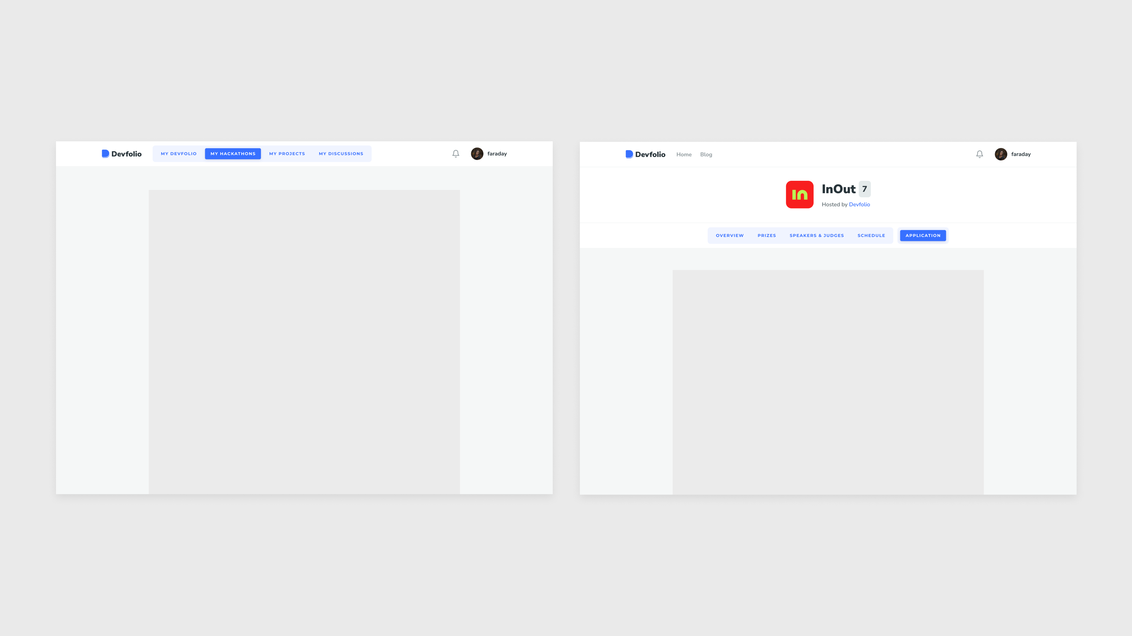
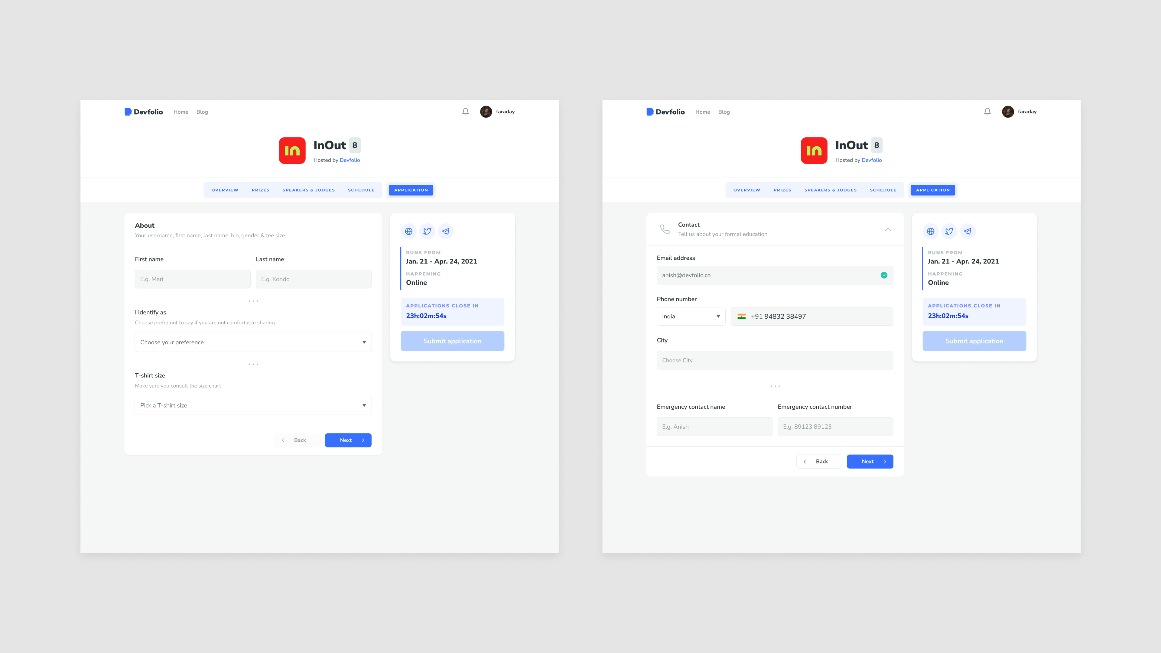
We chose to implement the application as a tab on the microsite:
- The drop off % was highest for new users, and they found the experience overwhelming. We wanted to provide users with a cohesive experience as they began their hackathon journey. By keeping everything in one place, users could easily access:
- Application status updates
- New prize / bounty updates
- Speaker and judge information
- Hackathon schedule
- Application status updates
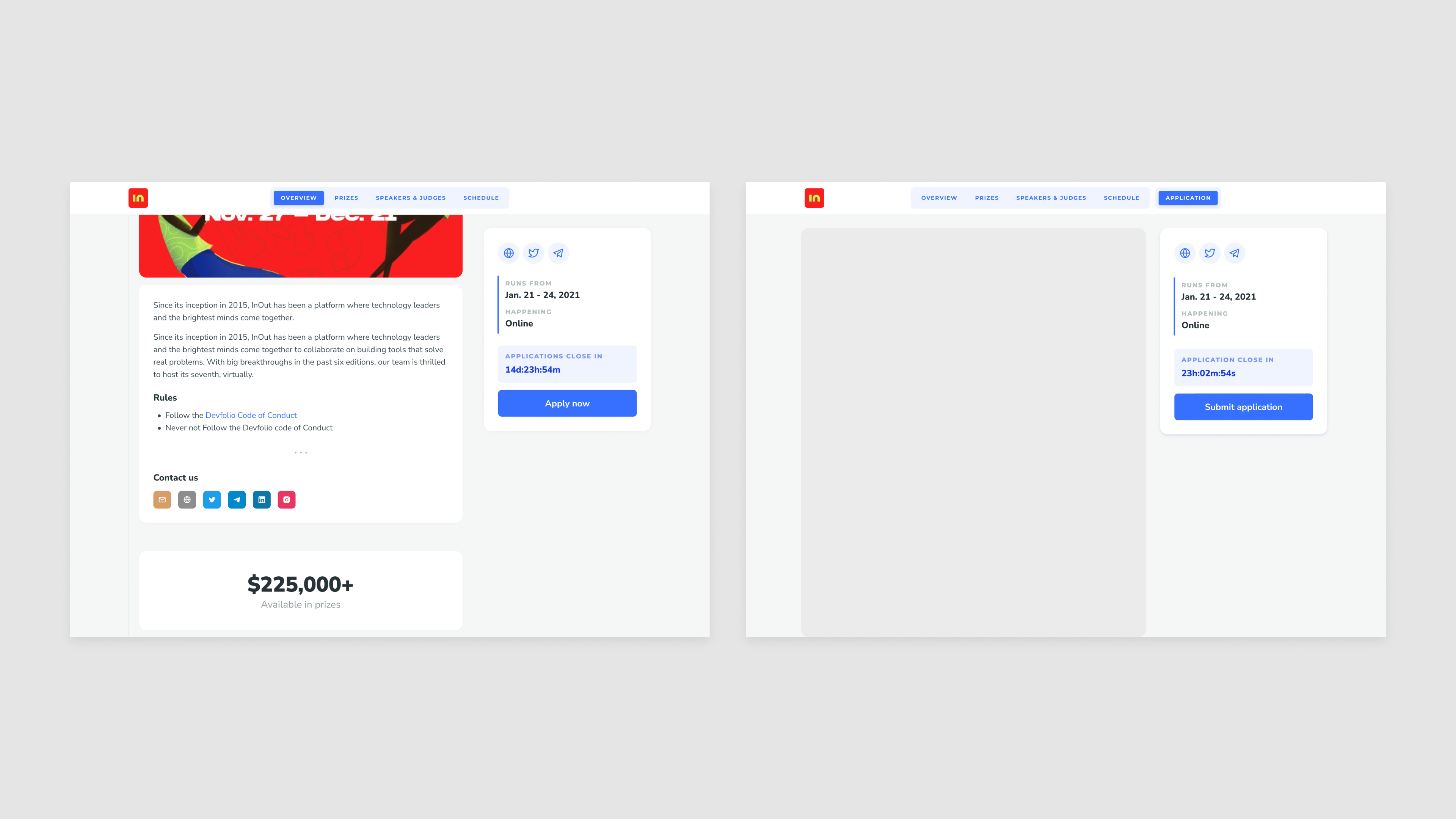
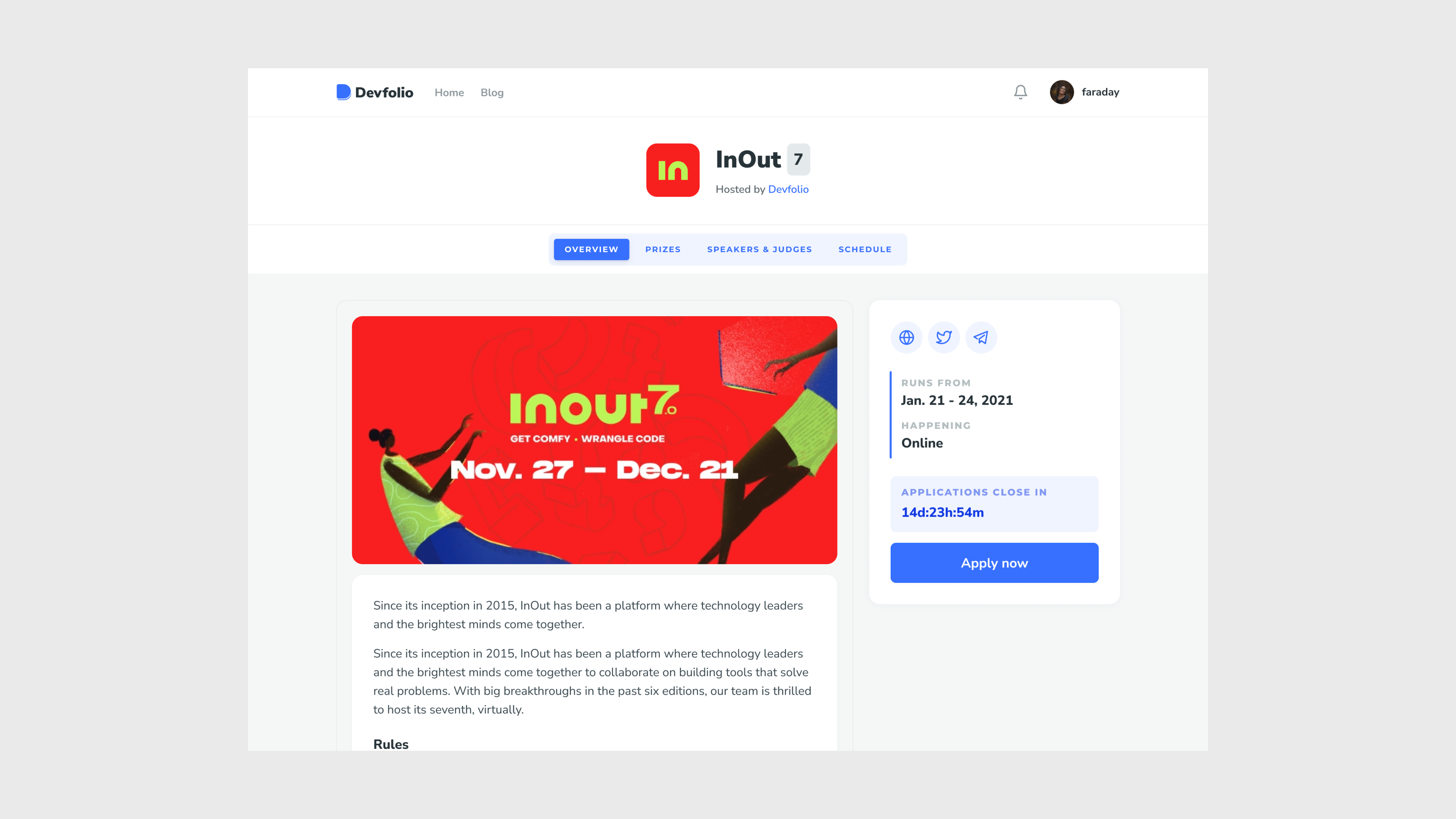
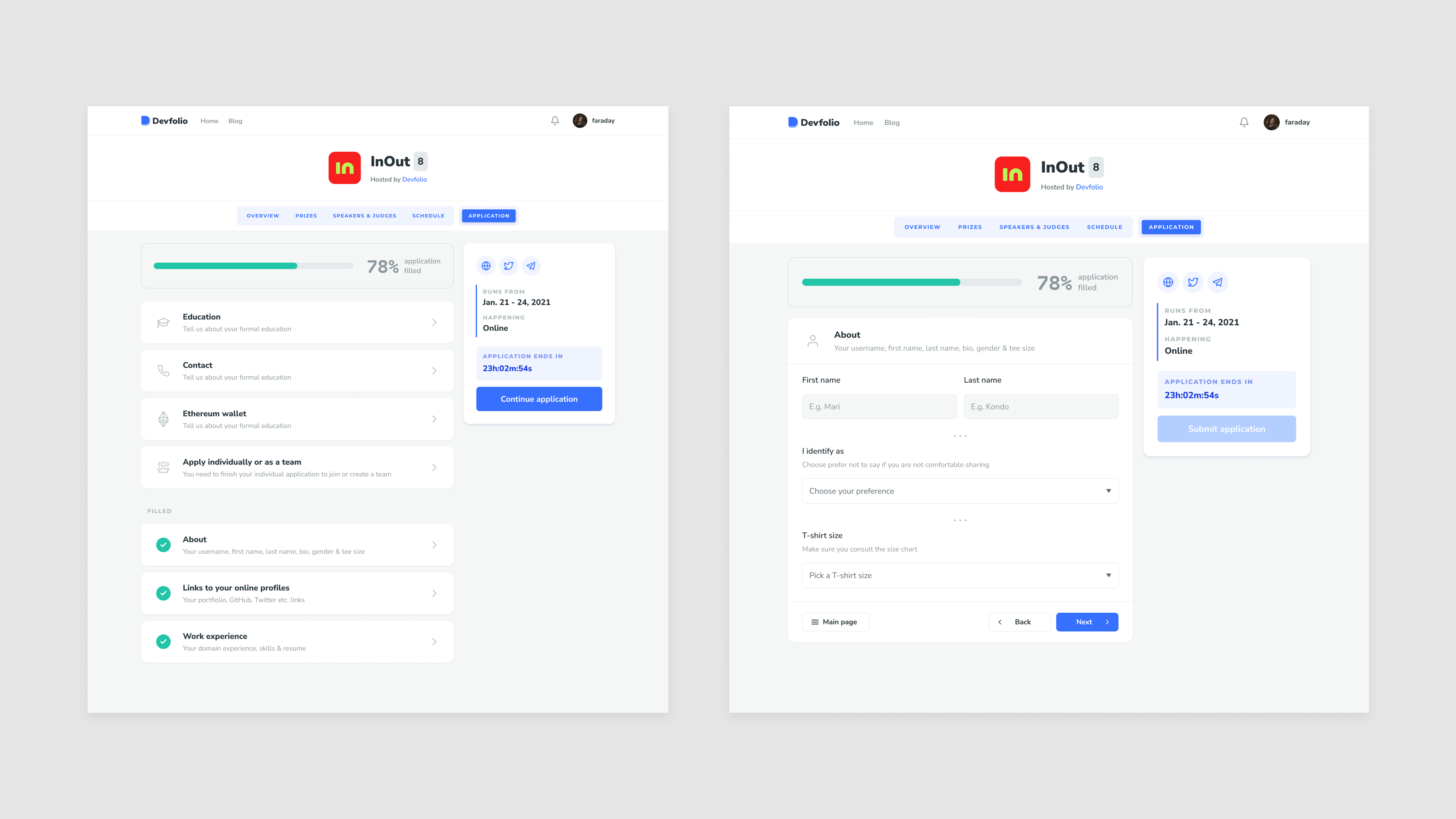
The microsite(on the left) allowed the users to read about the hackathon while keeping the most important information and the ‘Apply now’ CTA always accessible on the side bar.
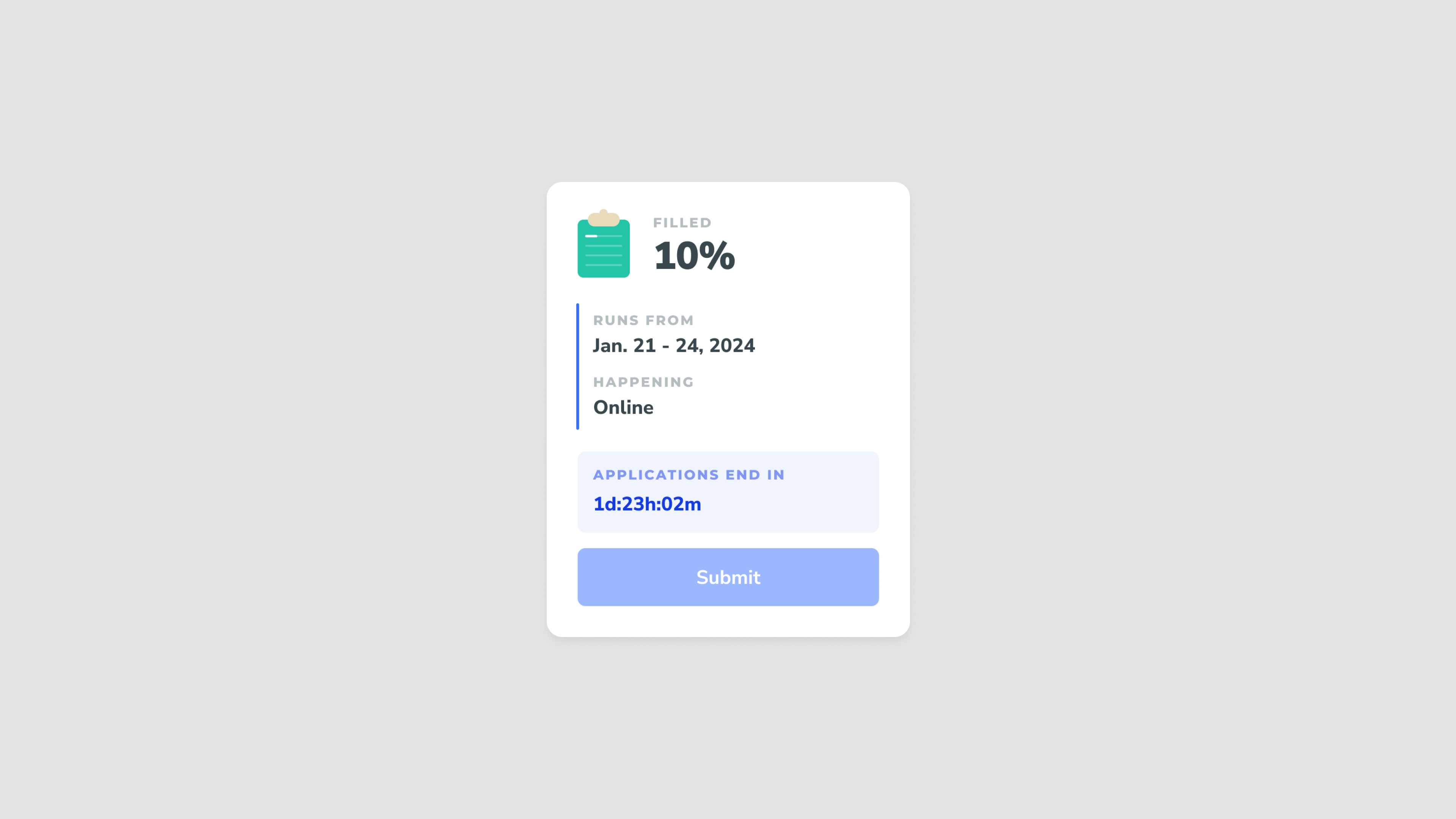
We preserved the structure and decided to change a few things, a countdown to when the applications close and a ‘Submit application’ CTA.
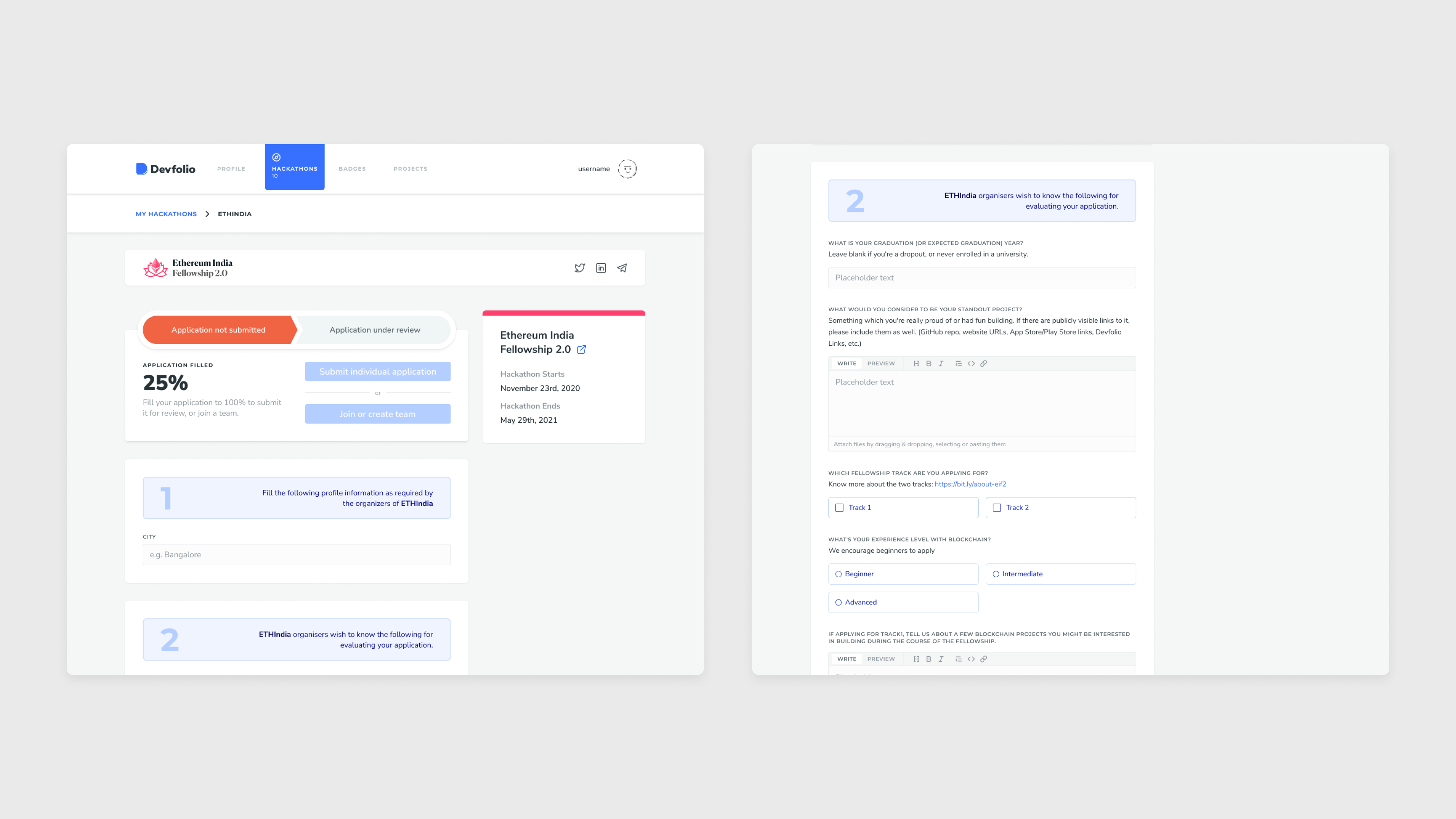
V1 application flow categorization:
- Information required by Devfolio (1)
- Information required by Organizers (2)
We took a more user centered approach and categorized fields as per the information required for the users to fill. E.g. About, Work experience, Education, Contact etc.
And present it in a section to section view, letting the user navigate and fill them.
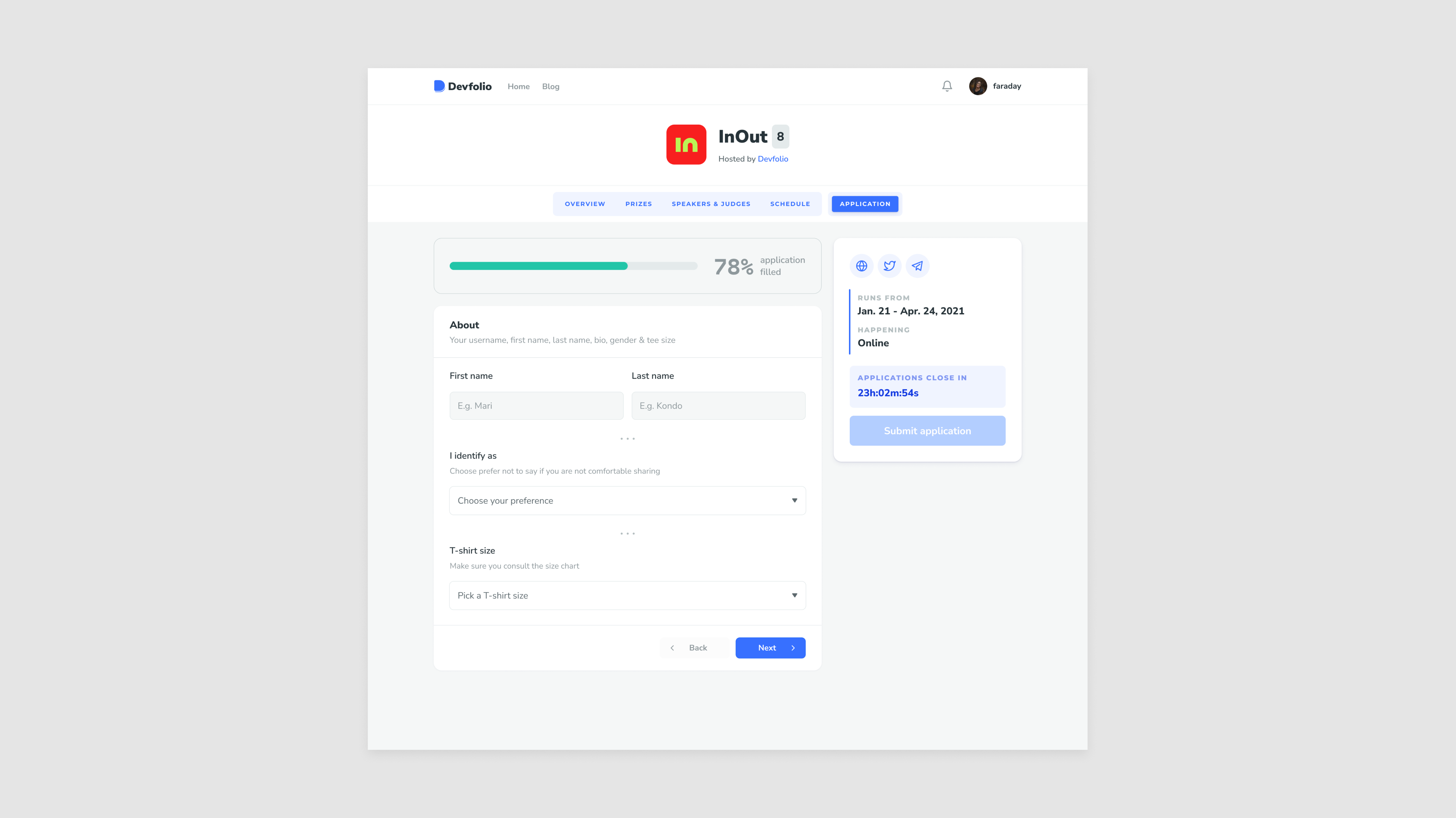
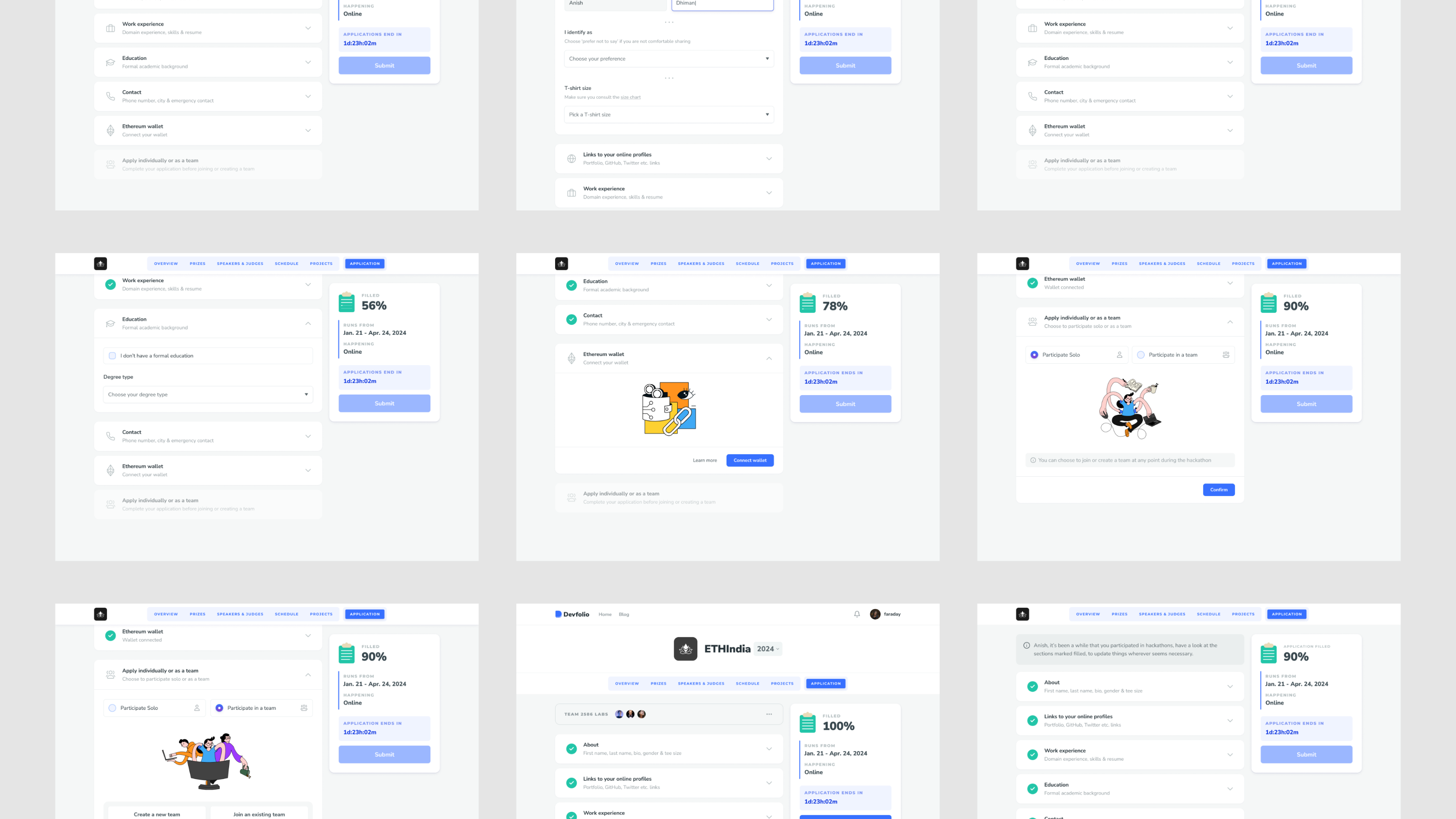
Showing progress was essential
Along with where you are in the application and what’s next. this is where we were approaching the limits of this component.
Communicating if a section was filled/not filled was equally important as showing the overall progress of the application. This is how users will be able to find that one field they missed, identify pre-filled sections and see overall progress.
We needed a way to show if a section had incomplete fields, so adding another progress layer to this component?
We had reached the limits of the current interface.
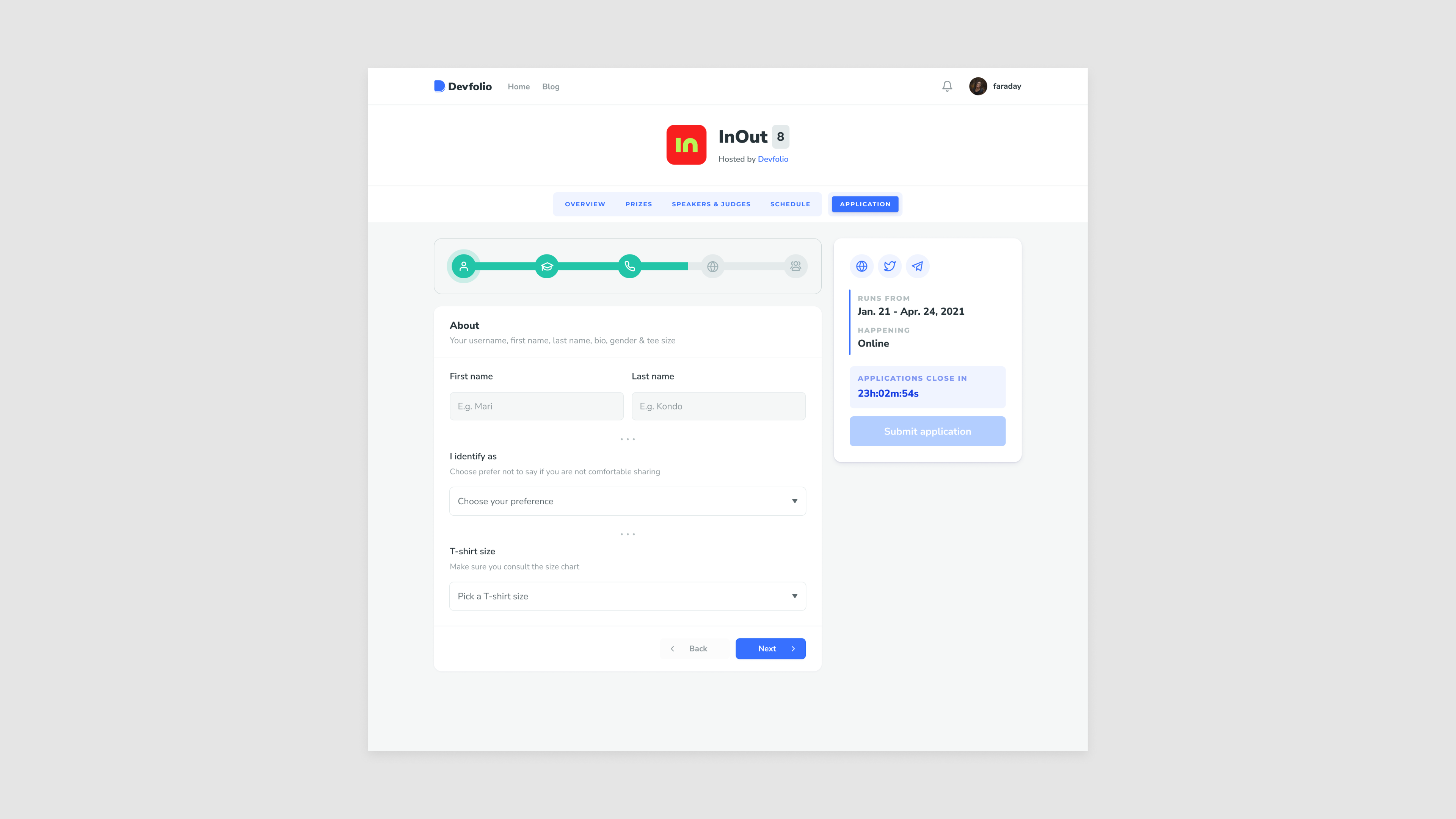
Solution? not one, but two different components:
- Shows overall progress
- Shows if a section is filled or not
A few different iterations:
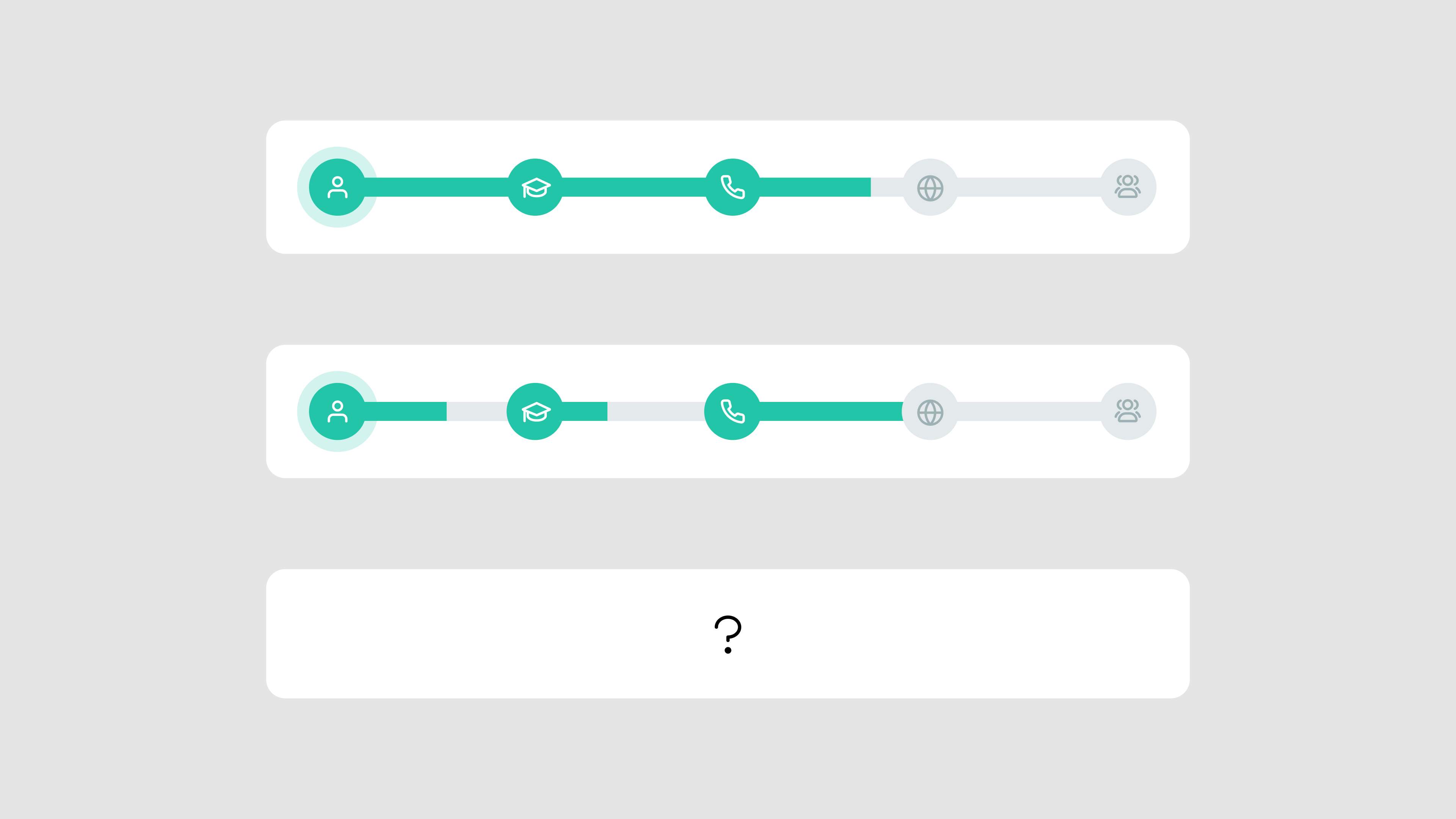
An index page which shows if a section is filled, groups the filled and un-filled sections.
Inside, it has the bottom navigation to move within different sections or to go to the index page. This felt rough. Would the order of the sections change as they move to filled sections? Would a user only be able to cycle in one group?
This navigation felt rough.
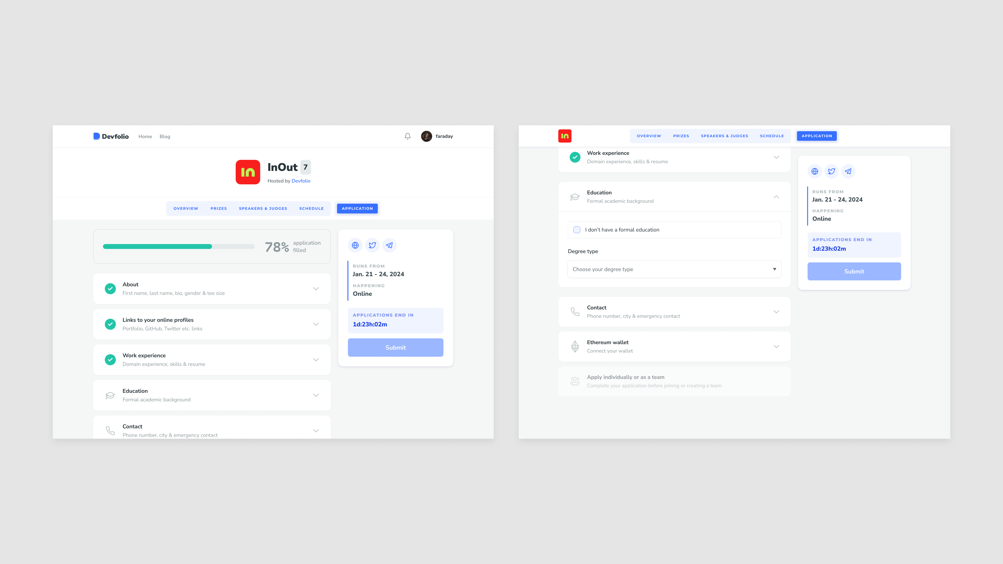
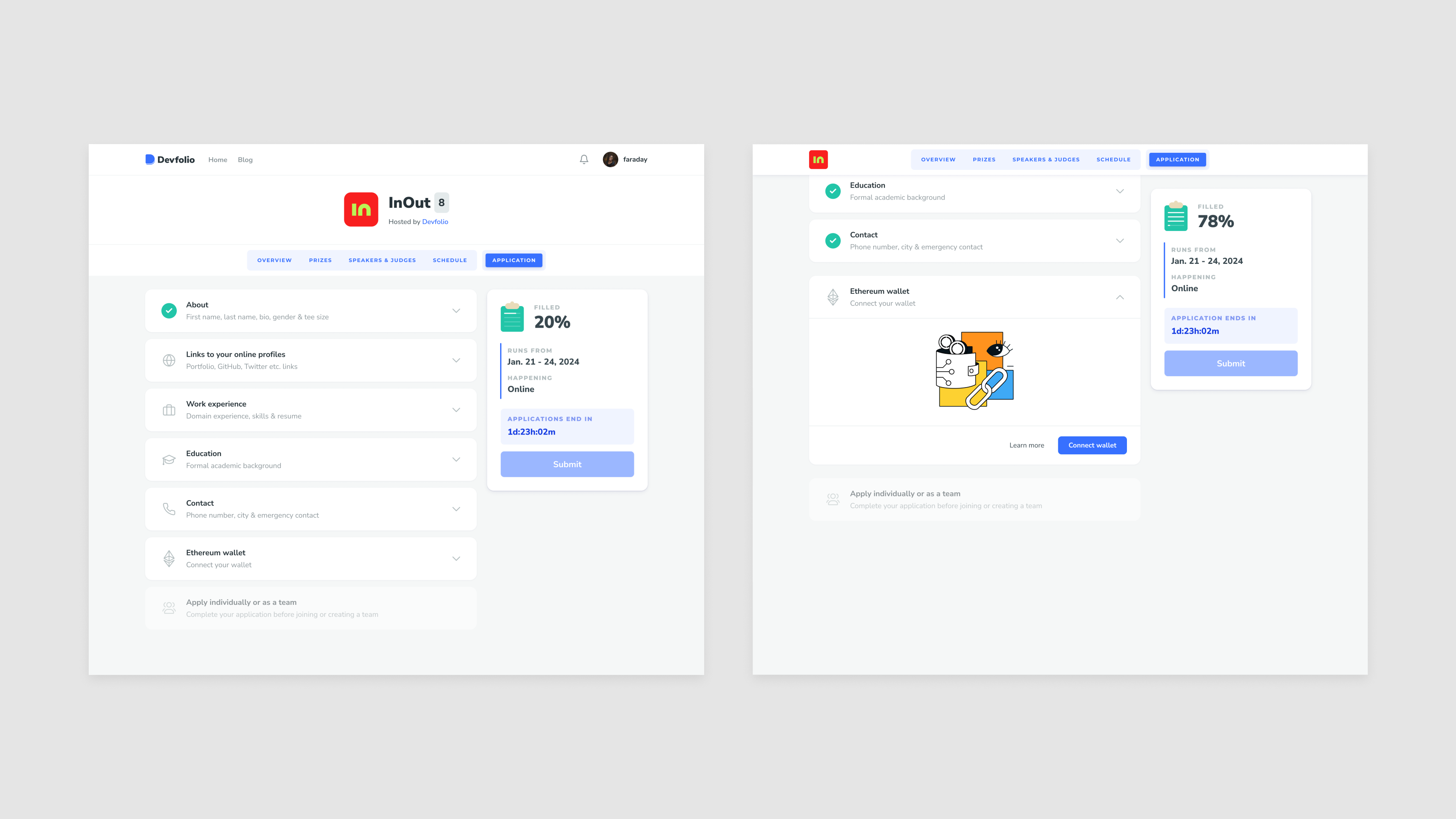
Having sections which can expand on click, and show up in the viewport of the user solved this navigational problem. We also implemented auto-save so users could switch devices if they needed to.
The form was now lengthier to scroll than before. We decided to show only one expanded section at a time, clicking on another section would open that one up and close the other.
The progress bar also gets hidden at the top while a user fills the form. It should be in view at all times, sidebar was the perfect place to put it.
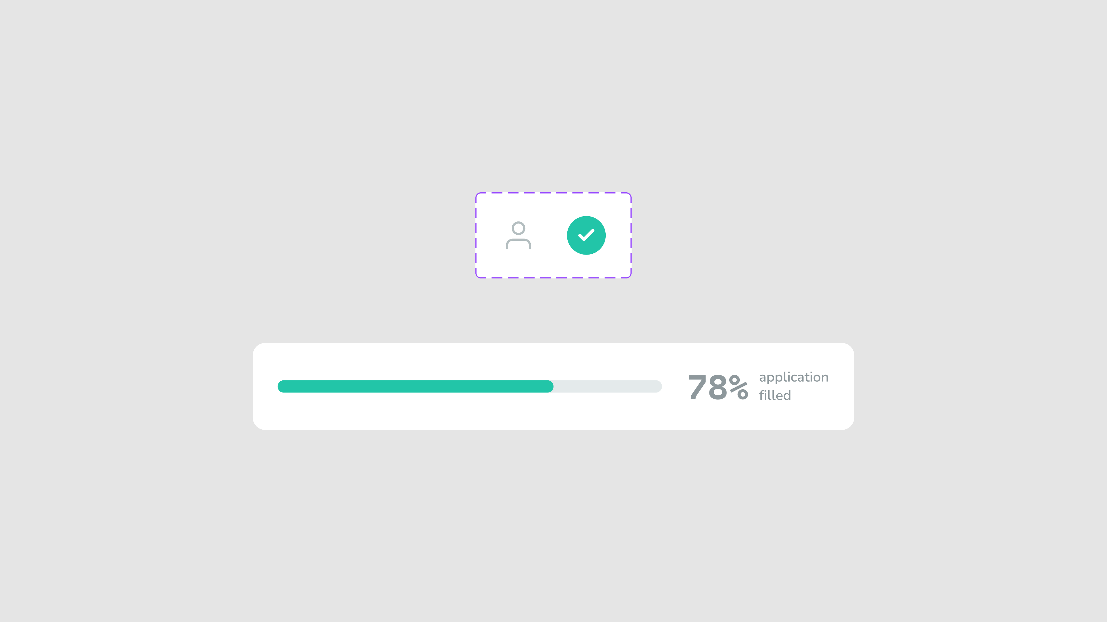
This is my favorite part of the entire project. A clipboard icon with the progress bar as the lines. I used Claude to animate this SVG for an input of percentage, the 4 lines, each representing 25% of the progress.
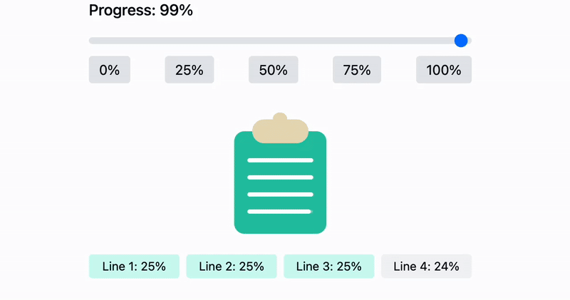
Within a few minutes of prompting, i reached at this stage, this was perfect. The code was handed off to the engineering team and they were able to implement it with little to very less effort.
This is how we got till here.
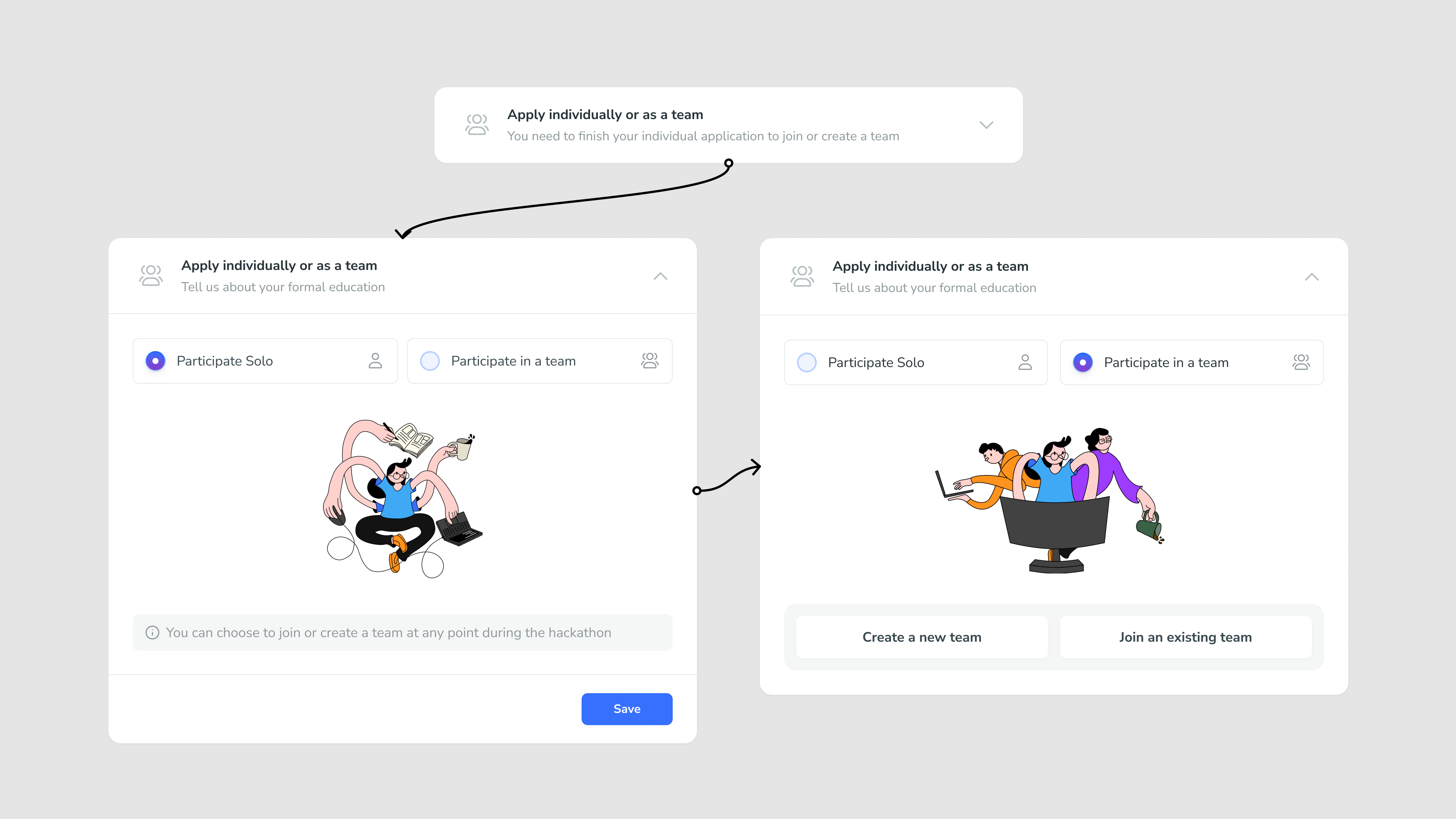
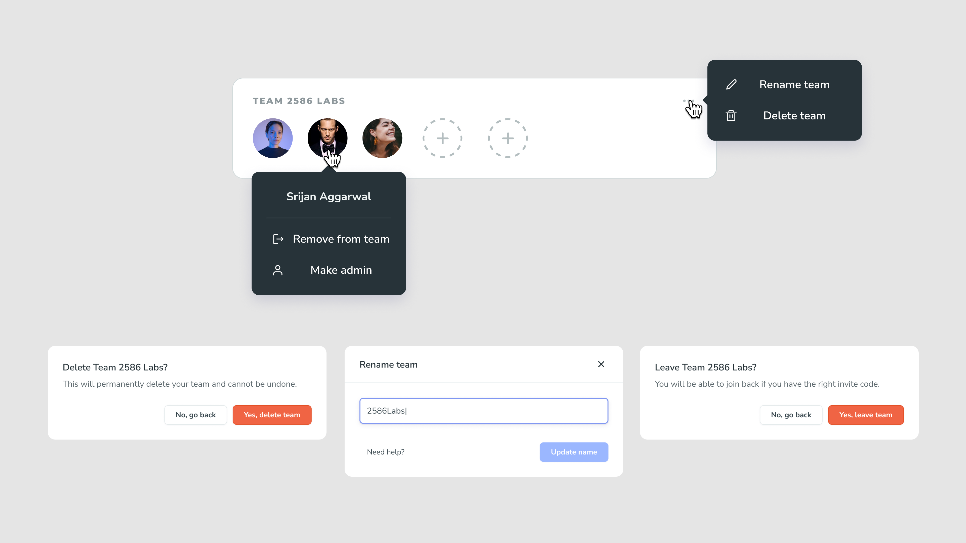
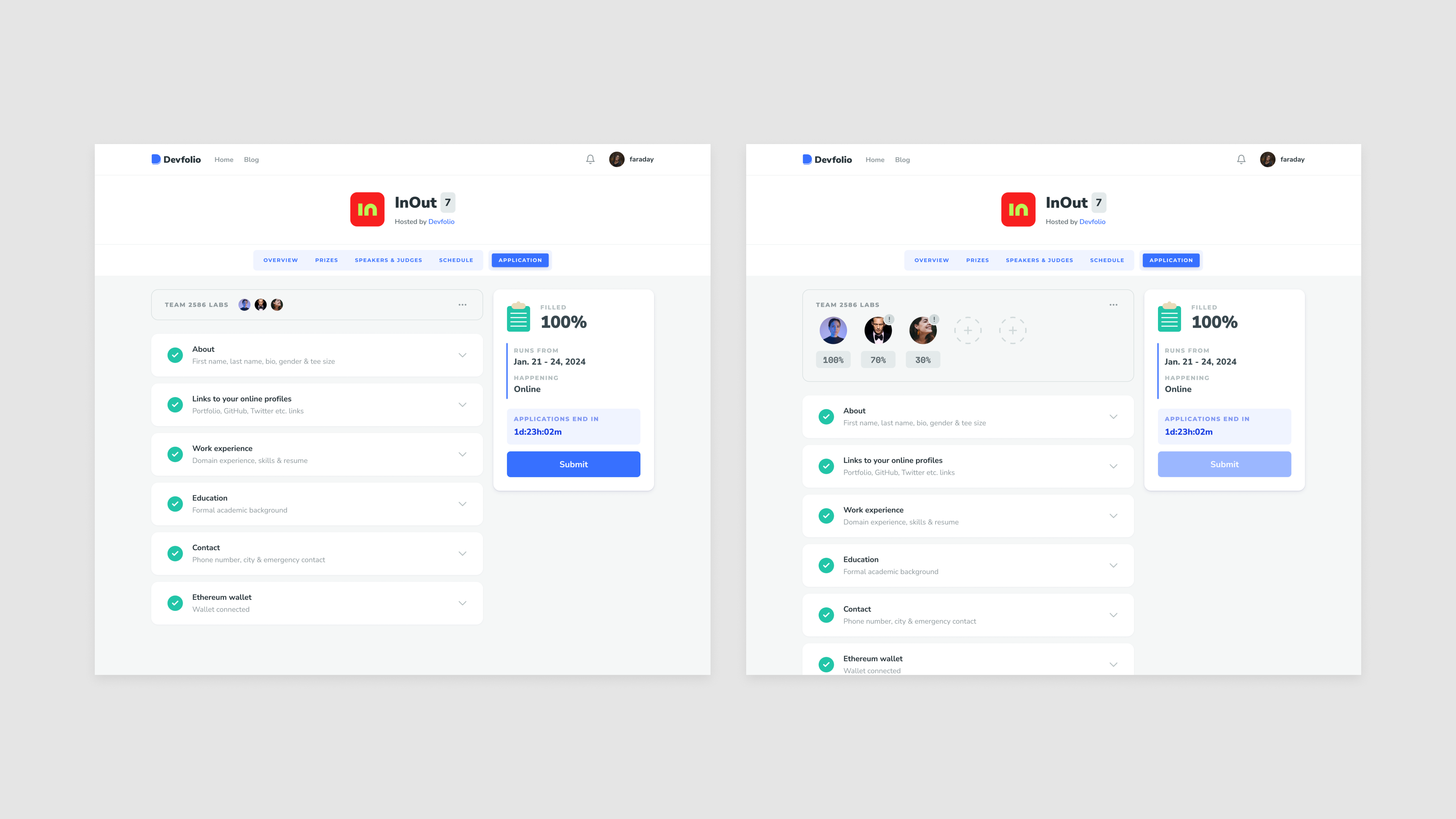
The user has to choose if they want to apply individually or as a team.
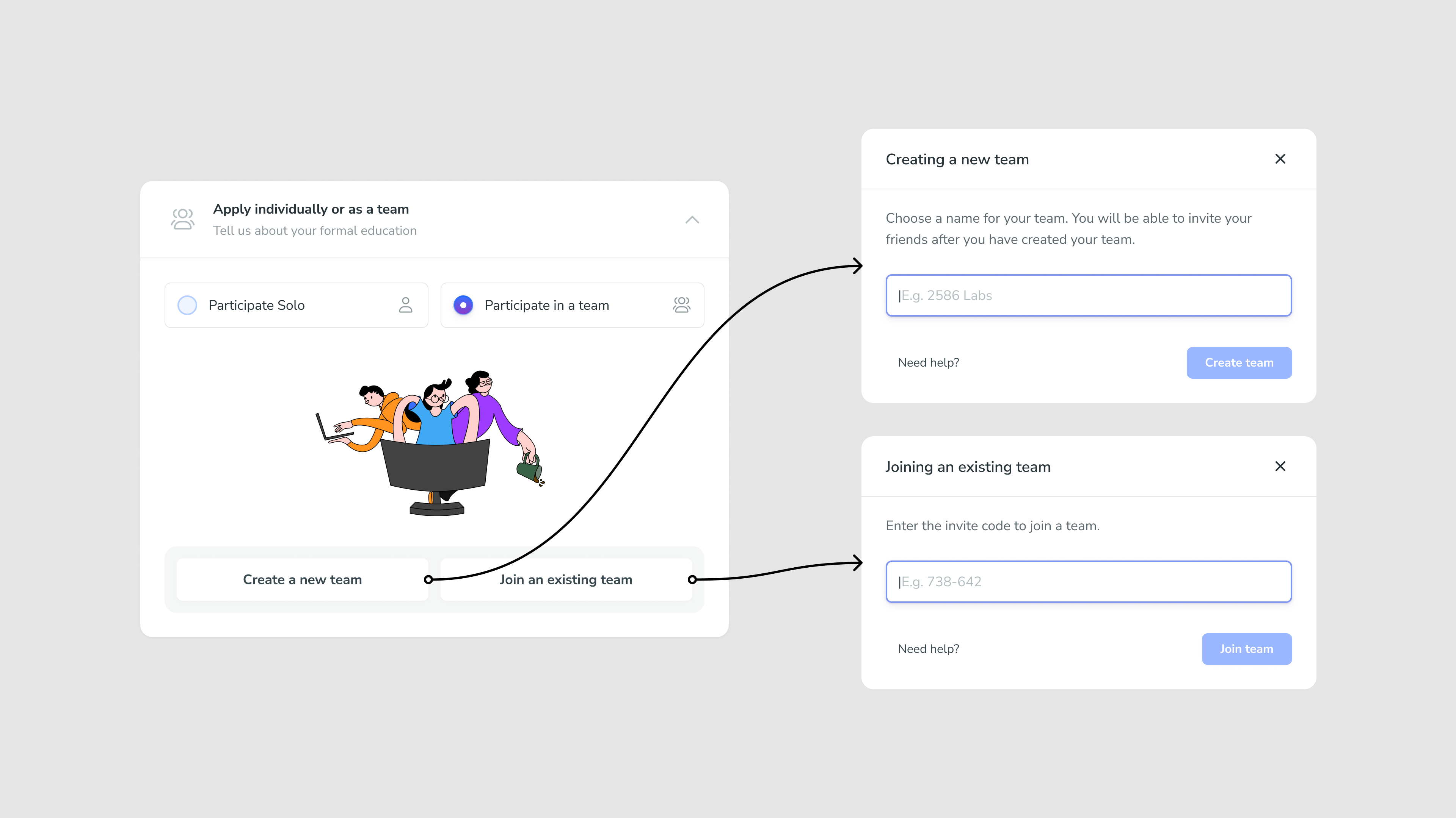
They can either create a team or join a friend’s team with an invite code.
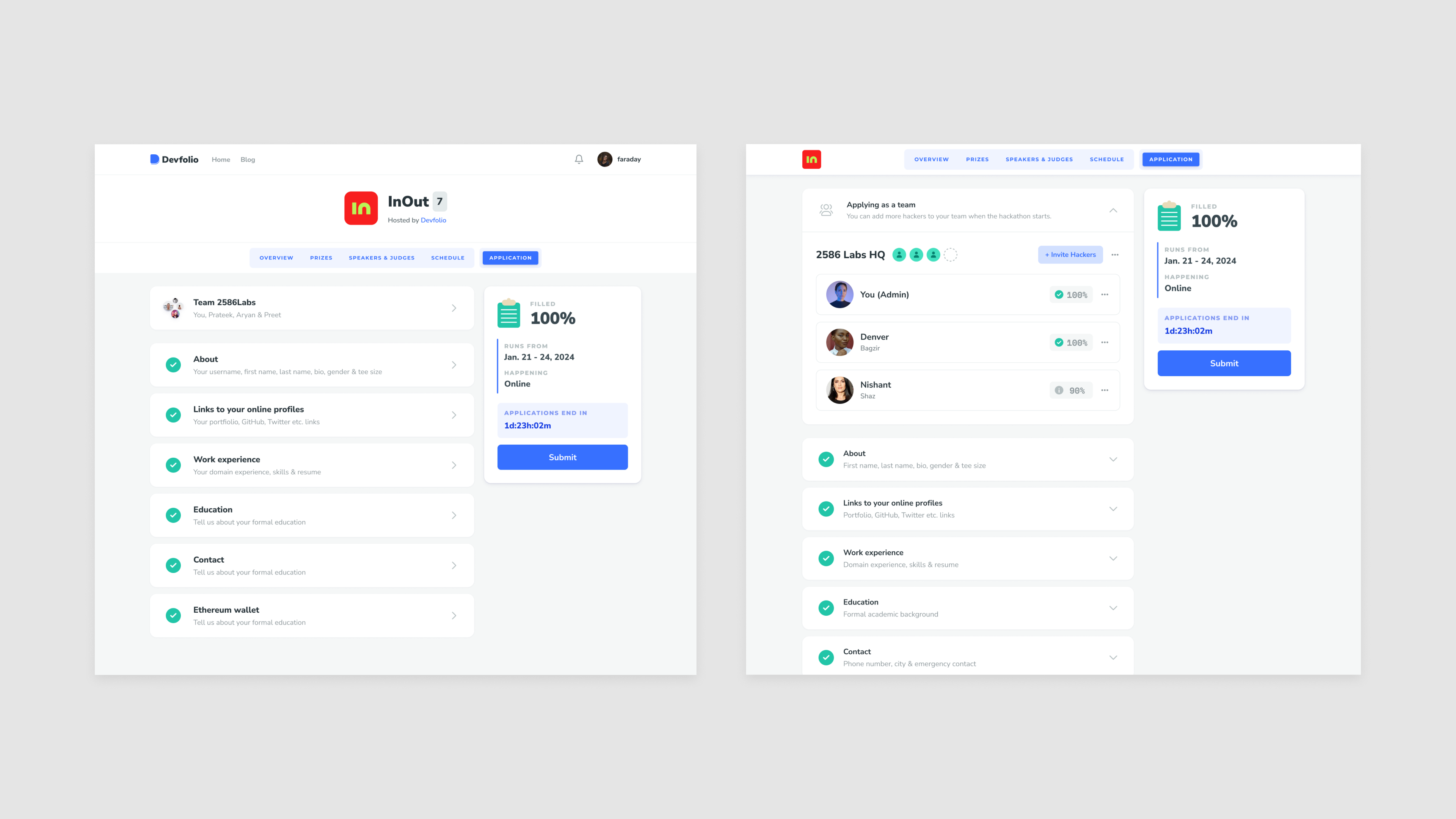
Once a user joins or creates a team, it moves to the top and stays there. A user can take all the team related actions from there. This would also carry forward to the dashboard once they submit their application.
It was a card but different from the others, for specific set of actions. It had to be distinct.
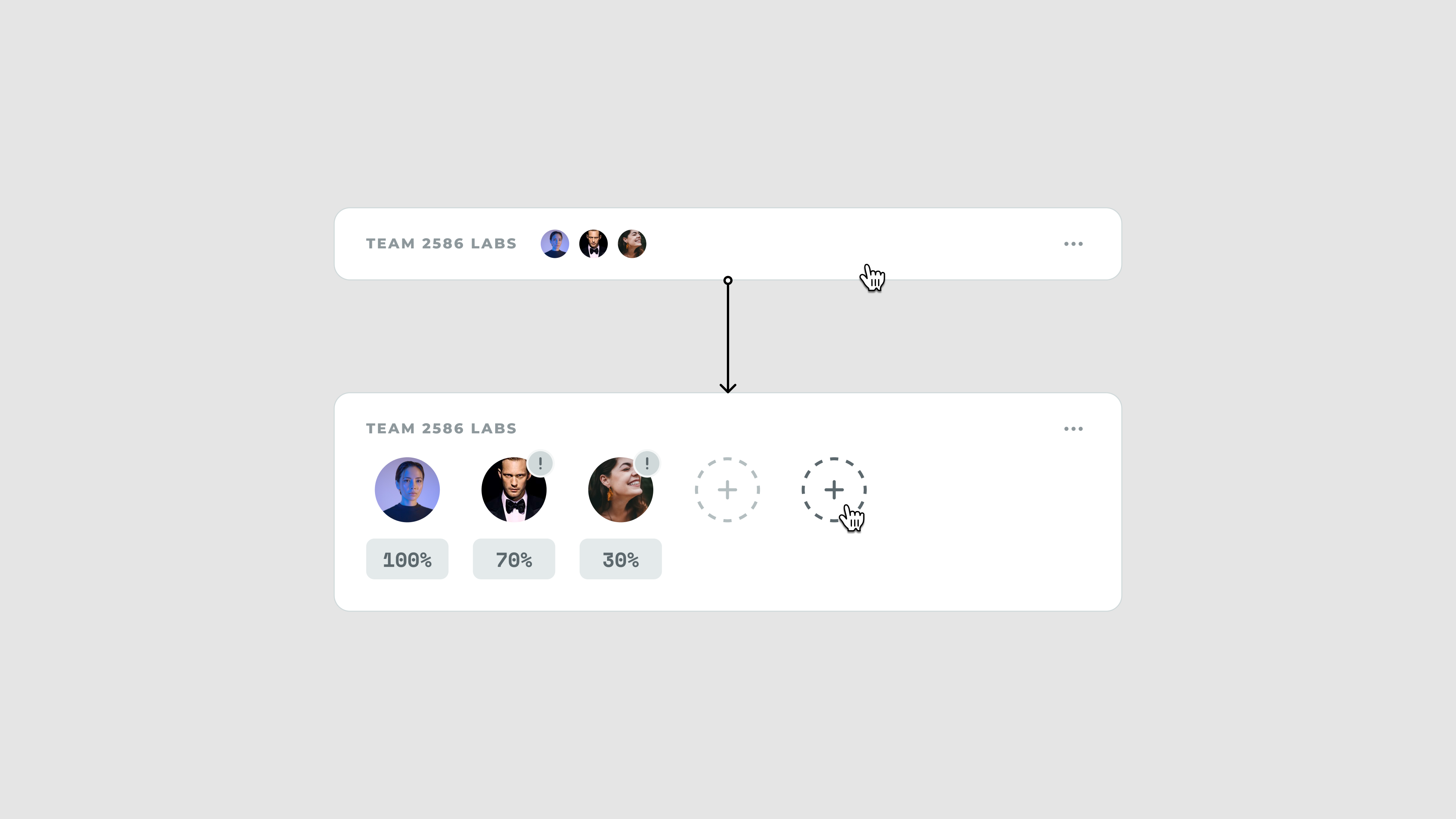
This is what we went with
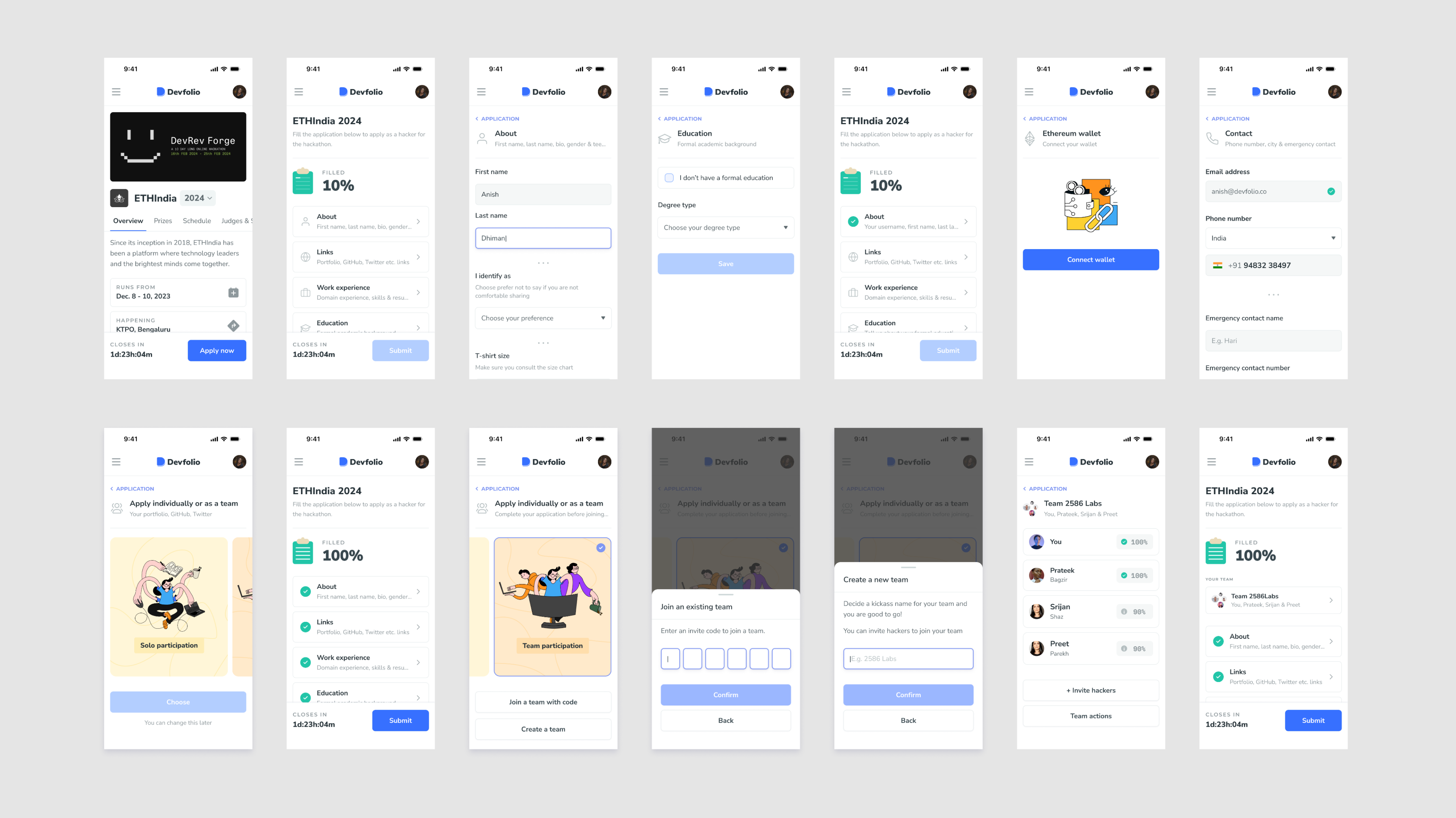
For mobile, we took a slightly different approach, each section as a page including the team controls. You see a some information regarding your team members on the team card.
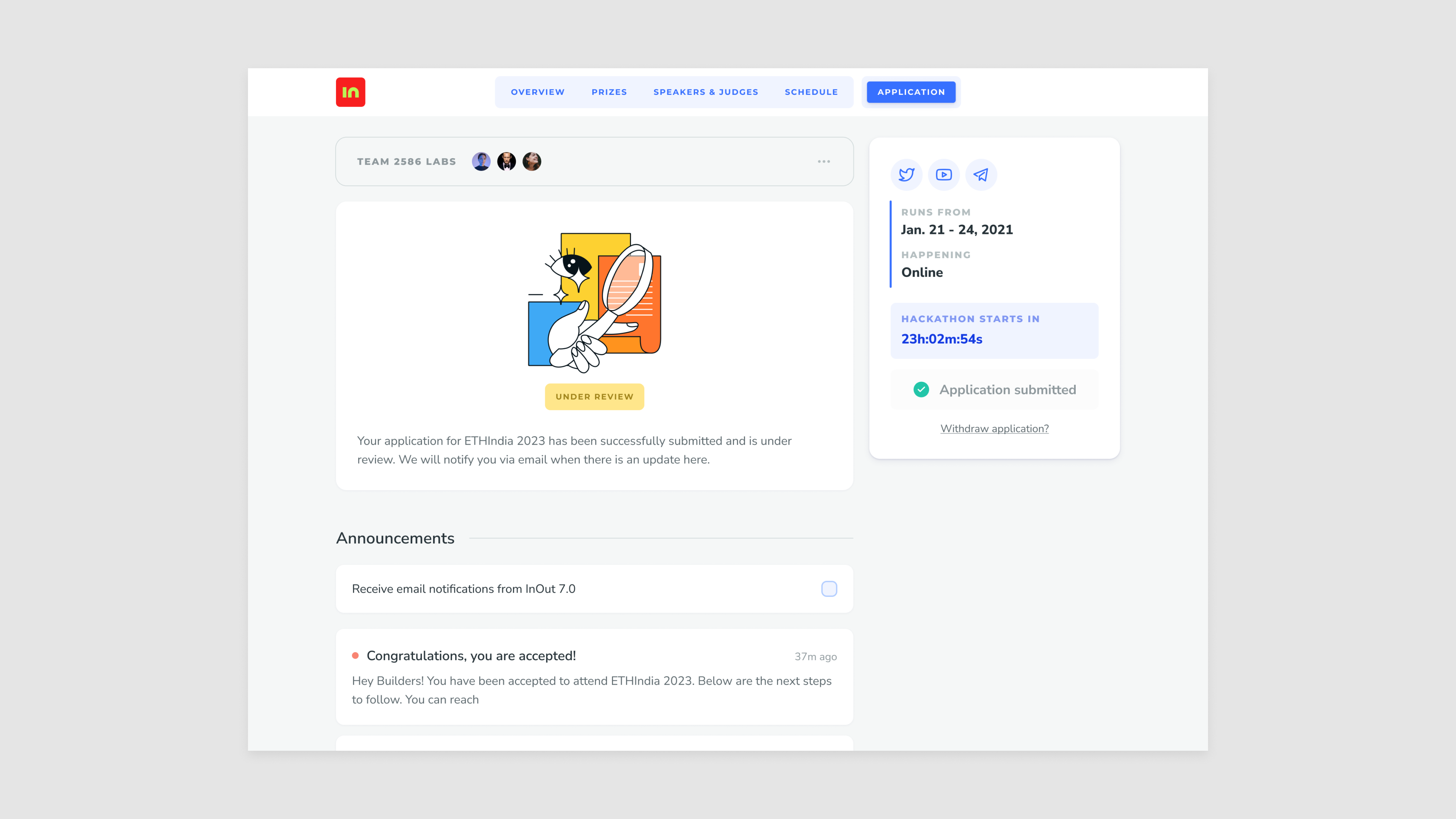
The moment a user submits their application, the interface changes to the dashboard - with their application status displayed prominently. The users have the option to withdraw the application, make changes and submit again until the applications for the hackathon are open.
We shipped this in May 2025.
Results
- Drop offs reduced by 30%
- Mobile completion increased by 15%
- Single session completion increased by 10%
Future Opportunities
Social Team Formation
- Skill-based matching
- “Looking for” discovery cards
- Request-to-join flows
Richer Collaboration
- Shareable team invite links
- Invite management dashboard
- Team preview cards
Beyond Application
- Complete hackathon journey
- Application to check-in experience